
ASSIGNMENT 2: VALUES + LINE + PLANE + GESTALT (20 pts)
Jump to Assignment Description
INTRODUCTION
Points/Dots, Lines, and Planes as the goal of graphic design is to efficiently connect a viewer with a message, when drawing or making symbols or images, refined renderings (drawings) are seldom the goal. Instead, graphic designers rely on the same tools artists use to render the natural world—points (or dots), lines, and planes (shapes) to distill a complex image or concept into a concise, direct, or evocative symbol or design. To graphic designers, points, lines, and planes are essential tools to plan, visualize, evaluate and ultimately communicate ideas to a broad audience.
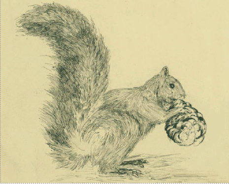
Squirrel, 1890, John Muir. In this drawing, the artist uses points, lines, and planes to realistically render a squirrel holding a pine cone. Photo by Carla Gates, used under license (CC BY 2.0).
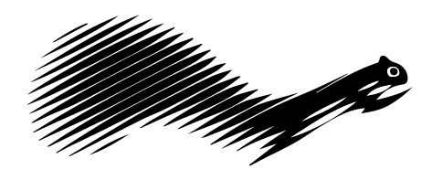
Ecureuil, Caisse d’Epargne, 1974, Roger Excoffon. In this graphic symbol of the same animal, designer Roger Excoffon uses points, lines, and planes to not only express the idea of a “squirrel” to the viewer, but to also convey the sense of speed and dexterity commonly associated with the animal.
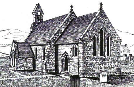
Etching of St. James in South Charlton, England. Artists can expand upon points, lines, and planes to create realistic renderings of people, places, and objects.

Symbol for St. James. A graphic designer can look at the same person, place, or object as an artist and uses points, lines, and planes to represent the subject symbolically for logos, signage, or promotional materials.

Yoshio Flies, 2009, Kat Gloor. Photography can capture the energy of a subject, as well as the basic visual elements of space, angle, and shape. Photo used under license (CC BY-NC-ND 2.0).
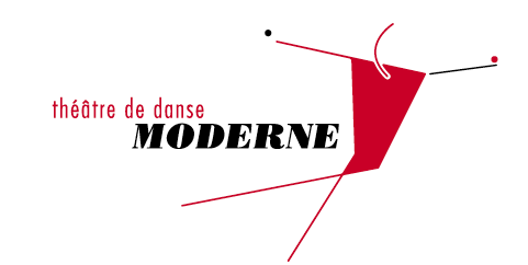
Symbol for a Modern Dance Company. A graphic designer can find inspiration in a photograph and uses points, lines, and planes to capture the energy and expressive power of the photograph to communicate a new idea , place, or activity.
WHAT IS GESTALT
With roots in the 1890s, Gestalt theory as a branch of psychology originated in Germany in the 1920s. While psychologists now debate its utility in understanding (as opposed to describing) how our minds work; it has great appeal for artists and designers because it provides a concise description of how the audience perceives a work, which can help with the effective production of a work.
Gestalt theory says humans group things (sounds, visual stimuli, feelings) together into a whole unit. For designers and artists this means that while a composition has individual parts that can be studied and analyzed as distinct components, the whole of a composition is different and frequently more important than the individual parts. It is especially important for designers to remember that visual elements in any visual communication work together and should reinforce one another as a means of communicating the whole idea or message. Noticse how shape, pattern, balance, rhythm, and postive and negative space work together to create unity, a gestalt.
Simple examples of the Gestalt principles. Note that many principles often work together in a single composition.

Girl Scouts of America logo, 1978, Saul Bass. Saul Bass used Gestalt to condense complex ideas—young women coming together in a spirit of mutual support and growth—into a single image.


Gestalt in design and branding, brand family logo, Coca-Cola Spain. Coca-Cola Spain unveiled this mark to represent the core family of Coke products: Classic, Zero, Diet, and Caffeine Free. How are they using Figure-Ground, Continuation, Similarity, and Symmetry? How do those principles combined to support the unity of the overall design (and brand) while still conveying complex concepts like youth, energy, and fun?
DESCRIPTION:
This assignment includes 2 visual outcomes working with dot/point, lines, and planes, composing within grids.
1. Value Scales using Graphite pencil, black felt tip pen, brush and ink.
2. Composition using the following, based in direct observation of various metal screws provided by instructor. This component of the assignment will use Adobe Illustrator.
- point, line, and plane
- symmetrical, asymetrical, circular balance
- repetition and rhythm
- emphasis and focal point
OBJECTIVES:
- Demonstrate craft and techncial skills working with a variety of media.
- Illustrate an understanding of tonal value, line, point, planes, repetition and rhythm, emphasis, focal point, and balance within a composition.
- Demonstrate skills working with Adobe Illustrator.
- Participate in constructive critiques and demonstrate ability to talk about your own work.
MATERIALS needed for this assignment
Required by you:
- Bristol Board Pad
- Graphite Pencils
- Black fine tip marker
- Black ball point pen
- Metal ruler 18" with cork backing
- Xacto Knife and #11 blades
- Pencil sharpener
- White Vinyl eraser or Kneaded eraser
- Adobe Illustrator
- Laptop + mouse
- Brushes -- provided by instructor
- Black India Ink - provided by instructor
- Containers ink - provided by instructor
FIRST THINGS FIRST. SET UP FOLDERS on your portable USB drive and in your SERVER account. As a class we will prepare your work for a digital portfolio.
- Make a class folder on your USB drive, titled: art132.
- Inside the class folder make a new folder titled: assignments.
- Inside the assignments folder make a new folder titled: assign2
- Place all files related to this assignment in the assign2 folder.
WHAT TO DO:
PT 1: Value Scales
IN CLASS THURSDAY February 8
- Introduce assignment
- Select screws for Composition (see PT2)
- Demonstration of value scale techniques and using media: graphic pencils, black felt tip pen, brush and ink
- DOWNLOAD DETAILS
HOMEWORK
- MAKE 3 DIFFERENT COMPOSITION SKETCHES, using pencils and paper
- Bring Value Scale materials to next class
DUE: TUESDAY February 13. CRITIQUE
PT 2: COMPOSITION
IN CLASS TUESDAY February 13 - Thursday February 15
- CRITIQUE - Compositions
- Work on Value Scales
- INTRODUCE Adobe ILLUSTRATOR
This composition is based on a variety of metal screws found at the hardware store - provided by the instructor. The screws, although small, are to be exaggerated in scale, with attention to details,and represented within the composition as lines and geometric shapes giving attention to creating tonal variations through repetition and patterns. AND being aware of balance and focal points, all working within a grid.
TECH DEMO - Illustrator Drawing Tools
- OPEN AI
- Make a new file
- 9" x 9"
- CMYK
- SAVE it as Practice
- Illustrator on using the drawing tools + working within the grid
SETTING UP COMPOSITION file
- Open AI
- Select a NEW file for PRINT.
- Set the DOCUMENT to 9" by 9"
- Set COLOR to CMYK
- Set Rastor Effects to HIGH 300 ppi
..................
- ADD a NEW LAYER. and name it: GRID
- SELECT the Rectangle Grid tool
- Click and drag within the 9" by 9" area.
- Click the grid to reveal the rectangle Grid Tool Options
- Set the rows to 8 and the columns to 8 dividers.
- Select the Move Tool and Center the Grid inside the 9" by 9" composition area.
- With the grid selected set the stroke color to Cyan a .5 size line
- SAVE your file inside your assign 2 folder.
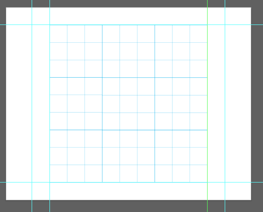
figure 1: grid layout for composition
HOMEWORK
- Complete Value Scales
DUE THURSDAY February 22
TUESDAY FEBRUARY 20 ADVISING DAY
IN CLASS THURSDAY February 22
- Cut 5 VALUE SCALES
- Clue the scales to a clean sheet of 11" by 14" sketchbook paper.
- LIGHTLY with pencil (4H) draw the margins:
- 1.5 inch left and righ
- 1 inch top and bottom
- .5 inch inbetween each value scale
- LIGHTLY with pencil (4H) draw the margins:
- Take digital photo and submit original to instructor
- SAVE the digital photo in your assign2 folder for this project.
- DEVELOP + DESIGN
- OPEN ILLUSTRATOR
- New File
- artboard 9" by 9"
- CMYK color
- BEGIN DRAWING AND COMPOSING
- Screw types can be repeated within the composition.
- Focus on details that are unique to each screw.
- Be aware of overall use of space within the composition as you develop it.
- Change the scale of the screws for variety and creating levels of emphasis.
- Allow image elements to be cropped as if extending beyond the borders of the composition.
- CAREFULLY ARRANGE LAYERS in Illustrator
- Use 1 LAYER for representing1 SCREW then lock the layer.
- ADD a NEW LAYER as needed for each screw of the screws.
- NAME your layers
- SAVE the file OFTEN
- all work related to this assignment must be inside your assign2 folder
HOMEWORK - February 22
- Draw the ASSETS (the screws, washers, nuts, etc) you plan to use in your composition.
- DRAW USING ILLUSTRATOR
- SAVE your work inside your assign2 folder.
DUE TUESDAY February 27 .
IN CLASS TUESDAY February 27
- MAKE 3 DIFFERENT COMPOSITIONS using the assets (the screws, washers, nuts, etc)
- ADD additional artboards within the Illustrator file
- PREPARE for PRESENTATION in CRITIQUE
- OPEN this InDesign Template
- SELECT the FRAME
- PLACE your .ai artboard 1
- when you select the .ai file BE SURE TO CHECK the BOX for "Show Import Options"
- Repeat this process for each artboard
- Add your NAME and a TITLE in the text box in the lower right of each page
- SAVE the .indd file
- PACKAGE the file
- Print the .PDF file
- Trim each of the 3 pages carefully
- PLACE your .ai artboard 1
DUE THURSDAY, February 29. CRITIQUE
IN CLASS THURSDAY, February 29
- CRITIQUE
- Present 3 printed compositions
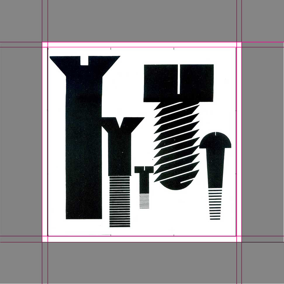
figure 5: Example of a completed composition 2. Armin Hoffman, Graphic Design Manual. 1965. p80.
VOCABULARY - GESTALT
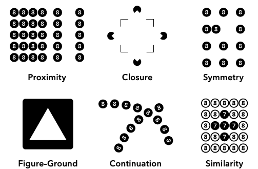
Closure: the mind supplies the missing pieces in a composition if there are enough of the significant features visible. Simple shapes require few clues while more complex ones may seem incomplete and forces the viewer to work harder to fill in the gap.
Continuation: humans will find lines or contours and continue them beyond their ending points if the elements of the pattern establish an implied direction. In photography, a winding road that extends beyond the image is one example.
Figure-ground: a fundamental concept in design, it refers to the contrast between black and white, foreground and background, dark and light and equilibrium. Adjusting the equilibrium can throw the figure-ground relationship off balance so the viewer is uncertain what they are viewing.
Proximity: objects that are close to one another appear to form groups. Even if they are different sizes or shapes or even radically different in color, they will appear as a group if they are placed close together. (See Figure 3 for examples of all of the Gestalt principles in use.)
Similarity: humans group objects together that look similar. In design, this can be applied to typefaces, colors, text, and headline styles.
Symmetry: the quality of being made up of exactly similar parts facing each other or around an axis. Symmetrical designs are balanced and easily understood by a viewer, but can be visually uninteresting. While asymmetrical designs can be awkward, they can also draw attention to themselves.
VOCABULARY - VISUAL ELEMENTS
Gestalt principles help designers and artists organize and make use of a number of design and art elements. In addition to the principles themselves, these are the terms to encourage students to make use of and understand their role in design and art.
Balance: a distribution of one or more elements which visually equal each other. Similarity, symmetry, and continuation rely on balance to be effective.
Compositional space: the area in which all elements of a composition interact. This could be a sheet of paper, a canvas, a package, etc.
Contrast: an abrupt shift in the appearance of the composition. Asymmetry relies on contrast, as can continuation and proximity.
Depth: the degree to which shapes, patterns, textures, etc. seem to move forward or backward in the compositional space. Figure-ground makes use of one shape seeming to exist in front of another.
Direction: an implied sense of motion in an element of a composition. Continuation relies on direction to guide a viewer’s eye.
RESOURCES
- Create a Grid Layout in Adobe Illustrator: https://www.youtube.com/watch?v=G7LWSXimCkQ
- Principles of Composition in Art and Design: Learning to Look, JSTOR Daily: https://daily.jstor.org/principles-of-composition-in-art-and-design/
- How to Use the Golden Ratio in Art Composition and Design: https://artignition.com/golden-ratio-in-art/