
ASSIGNMENT 3: COLOR (25 pts)
Jump to Assignment Description
IN CLASS TUESDAY March 19
INTRODUCTION
Color is such a dominant component of everything we encounter in the visual world that it can be easy to take it for granted. For artists and designers, however, the application of color is a deeply considered, deliberate choice, not simply an intuitive one. By better understanding how color is formed and the relationships between different colors, the color decisions in any piece of art or design becomes much more intentional and effective.
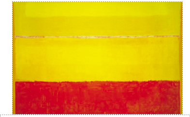
Untitled, 1952–3, Mark Rothko (detail). Mark Rothko used color to evoke "basic human emotions" such as joy.
Color is one of the fundamental elements of our existence, and defines our world in such deep ways that its effects are nearly imperceptible. Whether in the micro-sense with the choice of an article of clothing, or the macro-sense where cultures on the whole embrace color trends at the scale of decades, color is a signifier of our motives and deepest feelings.
The EFFECT of COLOR: https://www.pbs.org/video/-book-effect-color-book/
Josef Albers: 1888–1976): a German-born American painter, Albers completed Itten’s introductory course at the Bauhaus in 1920, eventually joining the faculty there. Albers would later go on to teach at Black Mountain College in North Carolina, where he taught American artists such as Robert Rauschenberg and Cy Twombly. Albers was well-known for his use of color in his art and his work on color theory itself. The Magic of Color: https://www.youtube.com/watch?v=l3xpTtn7zo8
Jane Davis Doggett (1929–): an American designer famous for her innovative use of color in public spaces for navigation and way-finding. Doggett also explores color in her art work, which combines the color theories of Albers with an expressive, narrative quality. (See Doggett’s work for the Miami, Houston, and Tampa international airports for excellent examples of color in use in environmental design, and her book Talking Graphics for her use of color in art.) Wayfinder in the Jet Age Documentary
April Greiman (1948–): an American graphic designer and pioneer of the New Wave school of design. Frequently noted for her early incorporation of the computer in her design practice, Greiman’s use of color both in print and environmental graphics is notable for its boldness and energy. (See Greiman’s identity design for Vertigo (1979), the 1995 commemorative stamp design for the 19th Amendment, and her Wilshire-Vermont mural for examples.) OFFSET - A Conversation + aprilgreimen.com
Hew Locke at the TATE: https://www.ppowgallery.com/artists/hew-locke#tab:thumbnails
Hurvin Anderson: Artist at the TATE: https://www.youtube.com/watch?v=I2nRnnVYuy4
COLOR SYSTEMS
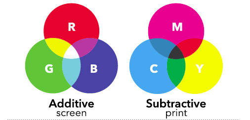
Additive and subtractive color models. As designers create work both for the screen (websites, apps, etc.) and for print (packages, magazines, etc.) it is extremely important for them to understand the uses and limitations of both the additive (RGB) and subtractive (CMYK) color models.
HUES, TINTS, and SHADES
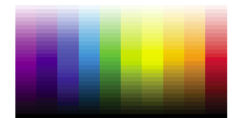
Hues, tints, and shades. Hues (middle row) trending toward white (tints) and black (shades).
SATURATION
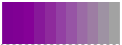
Saturation. As colors become less saturated they steadily lose intensity and become gray.
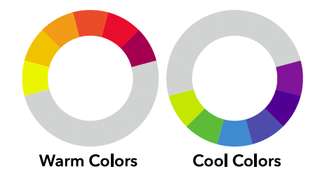
WARM + COOL COLORS
COLOR WHEEL

Farbkreis, 1961, Johannes Itten. Itten’s interpretation of the familiar color wheel using red, yellow, and blue primary colors.
COLOR RELATIONSHIPS
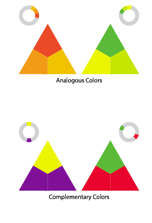
Analogous colors are groups of colors that sit next to one another on the color wheel, and can often be seen in nature (e.g. autumn leaves). While analogous colors can create a rich palette, it tends to be monochromatic (containing or using only one color) and lacking in the vibrancy of complementary colors. Complementary colors are those colors opposite one another on the color wheel, which cancel one other out (make a gray) when combined, but are extremely vibrant when placed next to one another.
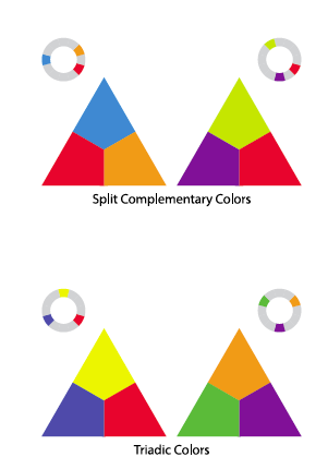
Split-complementary colors make use of the colors to either side of a color’s complement. While Split Complementary colors have much of the same vibrancy and contrast of complimentary colors, they create less tension between themselves. Triadic colors are those colors that are evenly spaced from one another around the color wheel. Triadic colors tend to be quite vibrant in relation to one another, even when used as tints or unsaturated variants of hues.
Additional Lecture Notes (PDF)
Art Context, Cultural Connections and Relevancy
Color is a dominant feature of the visual landscape, which is why the successful use of color can make design more effective in communicating an intended message.However, the use of color can also send unintended—or even unwanted—messages as well. Certain colors in western culture have become linked to certain concepts—such as gender—which can feel limiting to people who see themselves one way, but are addressed in another.
In August of 2015, the Target chain of department stores announced that it would move away from using stereotypical colors in its toy departments (among others), eliminating the use of pinks and yellows to identify certain toys or areas of the store as being for girls, and blues and greens to identify others as being for boys. As attitudes—and therefore design trends—change in the face of an ever-evolving culture and market demands, where else can you see colors that once were commonplace as a visual shorthand for certain concepts that have now fallen out of use?

Color in culture. How does changing the relationship between culturally understood colors and images affect their meaning? How does it affect how we respond to them as a society?

Color in culture and branding. Does a color shift from more traditionally athletic or aggressive colors of red and black in the Adidas logo change how the brand might be perceived? Do pink and green make the logo seem more casual or playful? How accepting of this kind of change do students feel they—or the people students imagine as the typical Adidas customer—might be?
DESCRIPTION:
This assignment is about COLOR. You will learn how to mix color both manually with paint and digitally using Illustrator. You will make a CMYK color wheel and color value scale using paint, and duplicate the value scale using Illustrator.
Finally you will develop a pattern using Illustrator and in a series of 3 compositions present the same pattern using different color schemes.
MATERIALS
You Provide:
- Plastic container for holding water (recycle a short wide plastic contianer that might have had yogurt or cut fruit, for example.
- Bristol Board Drawing pad (11" by 14")
- X-acto knife and new blades
- Kneaded eraser and/or vinyl eraser
- Graphic Pencils
- Metal ruler
- Drafting tape
- Something rigid and flat with smooth surface, about 9" by 12"; to be used for taping palette paper for mixing paint; the instructor will supply the palette paper.
- glue stick (if you have one)
Instructor will provide:
- paint
- brushes
- disposable palette paper
- palette knife
- glue stick
- compass
FIRST THINGS FIRST. SET UP FOLDERS on your portable USB drive and in your SERVER account. As a class we will prepare your work for a digital portfolio.
- Make a class folder on your USB drive, titled: art132.
- Inside the class folder make a new folder titled: assignments.
- Inside the assignments folder make a new folder titled: assign3
- Place all files related to this assignment in the assign3 folder.
WHAT TO DO:
PT 1 - READINGS + COLOR WHEEL
READ
- Chapter 13, in your Design 2D and 3D textbook
- COLOR chapter (pp. 81-97) and PATTERN chapter (pp. 201-213) in your Graphic Design The New Basics textbook
IN CLASS TUESDAY March 19 - THURSDAY March 21
1. Make a CMYK color wheel using acrylic paint and your bristol paper. (10 pts)
- Your color wheel must have middle gray in the middle surrounded by cyan, magenta, and yellow.
- This middle triangle will be surrounded by red, blue, and green.
- There will be an outer color wheel with the remaining colors.
- Your color wheel should fit onto a square 9x9” piece of bristol paper.
- You can paint swatches and cut them out using your exacto knife and then glue them to a new sheet of bristol or paint directly on your bristol paper.
- Craft and presentation are important for the final product.
- Your painted swatches should show as little brush strokes as possible.
- The paint application should be flat without dirt or specks. As a tip, to make your paint a little less transparent, try adding a little bit of white but not too much that it changes the hue.
DIRECTIONS for MAKING the COLOR WHEEL as seen above -
A DEMO will be given in class on TUESDAY March 19
- Get a clean, sheet of your Bristol Board paper
- Use a 4H, 5H or 6H graphic pencil
- Find the center point
- Use your metal ruler and draw LIGHT diagonal lines from the upper left corner to the lower right corner of the paper, and from the upper right corner to the lower left corner.; where the lines intersect is the center point.
- Add "marks" to indicate 4" in all directions from the center point: top, bottom, left and right
- Adjust the locking compass (provided by instructor) for 4 inches from the center point
- Draw the out edge of the circle with the compass.
- Divide the circle into 12 equal sections
- Place your compass (still set at 4 inches) at each of the 4 "marks" and lightly draw a line where the compass pencil intersects with the circle.
- Lightly draw lines from the center point to the intersection points on the circle.
- Adjust your compass to draw a small circle in the center of the larger circle.
- Make the small circle 1.5" across, .75" in diameter.
- Indicate the band for the outer ring of colors.
- Measure 1.25" from the outer circle making about 4 marks to use as a gudie when adjustung the compass.
- Adjust the compass and draw the inner circle of the outer band for the colors.
- Draw the large triangle that surrounds the small inner circle.
- Place the point of the triangle at the center of one of the outer blocks within the color ring. Place the remaining 2 points of the triangle in the middle of a color block, equally spaces (5 blocks apart).
- Draw the final triangles that surround the large triangle in the center.
- Use your ruler to draw a line from the point of the large triangle so that it intersects with the bottom ring of the band for the colors; mark this spot and draw the connecting lines.
- Carefully erase all non-essential pencil lines.
MIX COLORS - Demo will be given in class.
- Use a clean sheet of palette paper to practice mixing each color.
- Test painting the mixed color on a clean Bristol Board paper to practice mixing each color.
- Once you have a mixture right you can paint the color in the correct space in your color wheel.
- Use your drafting tape along the edges of the color blocks to maintain a clean edge of paint.
- If you make a mistake in painting the color on the color wheel you can paint a sample on piece of Bristol Board and carefully cut it and glue it into place onthe wheel.
2. MAKE COLOR SCALE with Illustrator and paint (5 pts)
- Create a color scale in Adobe Illustrator.
- Open Illustrator
- Create NEW FILE
- cmyk color
- artboard should be 17" wide x 8.5" high.
- Choose 2 complementary colors from your color wheel to work with.
- You will create an 11 step color scale starting with one complementary color and ending with the other complementary color.
- Each set of complementary colors will have a different middle hue but it should be a gray hue. (Mixing 2 complementary colors results in a grey)
- Make rulers visible and use guides to indicate margins.
- .25" margin left and right
- 3.5" margin top and bottom
- Divide the center area into 11, 1.5" squares
- Set the fill to NO FILL for now
- Set the stroke to .5 width and light gray
- USE CMYK color scale and move the slides to mix the colors.
- When you have the right color select the square and FILL
- Slowly mix the two complimentary colors together.
- remember each set of complementary colors will have a different middle hue but it should be a gray hue.
- Save the Illustrator file
- Save it again as Adobe PDF
- CREATE a color scale using paint.
- On a clean sheet of Bristol Board paper lightly indicate the left and right margins ar .25"
- The bottom margin @ 1"
- Measuring up from the bottom margin lightly draw a row of 6, 1.5" squares
- After move up 1" and lightly draw another row of 5, 1.5" squares
- There should be a 1" margin between the two rows.
- Use the SAME 2 complementary colors selected above.
- Lightly indicate 1.5"x1.5" squares for your 11 step color scale starting with one complementary color and ending with the other complementary color.
- Each set of complementary colors will have a different middle hue but it should be a gray hue.
- During this color scale, colors tend to get dark so sometimes you need to add a little white to brighten each hue.
- Much like your value scales, even pacing is important.
- Each hue should fit into a perfect square. Each hue should be the same size square.
- It is easiest to paint a swatch on a separate sheet of bristol and then cut and adhere it to a final piece of bristol.
- Cut and glue your painted scale onto mounting board (provided by instructor)
- adhere the color scale to the center of the mounting board.
- use rubber cement (provided by instructor)
- lightly coat the mounting board with rubber cement where you will place the color scale
- lightly coat the back of the color scale with rubber cement.
- let both partially dry.
- carefully place the color scale onto the mounting board.
Your digital and analog/painted color scale should be as identical as possible.
DUE TUESDAY March 26.
Present Color Wheel and BOTH Color Gradation Scales using the two complementary colors
PT 2 - Patterns + Color (10 pts)
IN CLASS TUESDAY March 26.
- Make the complementary color scale with Illustrator using the same colors as used in the painted version.
- DEMO given in class
- Print AI Complementary Color Scale
- CRITIQUE on Color Wheel and Complementary Color Scales MOVED to THURSDAY APRIL 4
INTRODUCTION TO PATTERNS + COLOR
- Using Adobe Illustrator make a NEW FILE
- CMYK
- SET UP 3 Artboards, each 9" by 9"
- Develop a CONCEPT for a SHAPE that can be repeated as a pattern
- Explore the types of patterns below.
- Draw the shape that can be repeated
- try to draw your shape approximately .5" square-ish
- Decide on 1 of the pattern structures below.
- In ARTBOARD 1 place your pattern
- Repeat the pattern on the ARTBOARD 2 + 3
- CHOOSE a different COLOR SCHEME for each of the patterns on each artboard.
- Complementary Color Scheme
- Analogous Color Scheme
- Triadic Color Scheme
- Split Complementary Scheme
- Monochromatic : a base hue and a selection of that hue's tint, shades, and tones.
- tint = Hue + white
- shade = Hue + black
- tone = Hue + grey
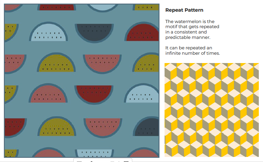
- SEE some examples of a pattern repeated using different color scheme on page 96 in your textbook Graphic Design the New Basics
IN CLASS TUESDAY April 2.
- Work on Patterns and Color PT2
- quiz/exercises related to readings
............................
DUE THURSDAY April 4
- CRITIQUE on ALL components of this assignment
- Prepare Powerpoint Presentation of this work and submit to instructor via ONE DRIVE and sharing the link for download
..........................................
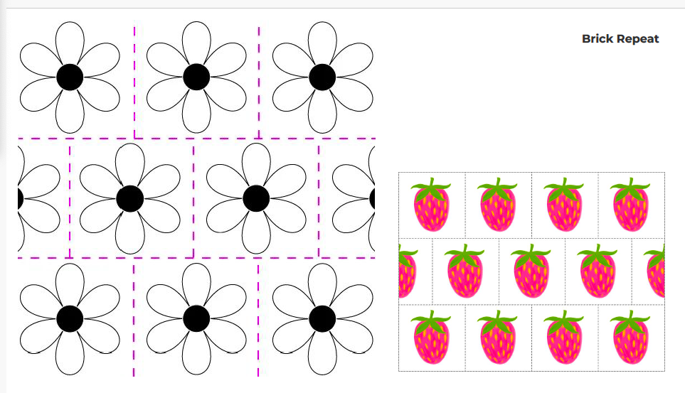
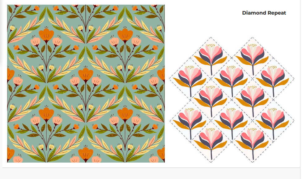
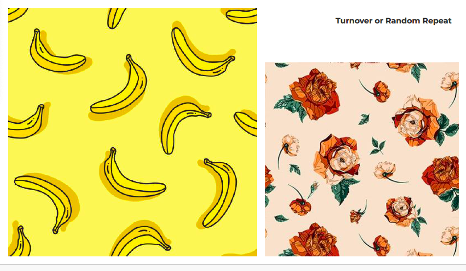
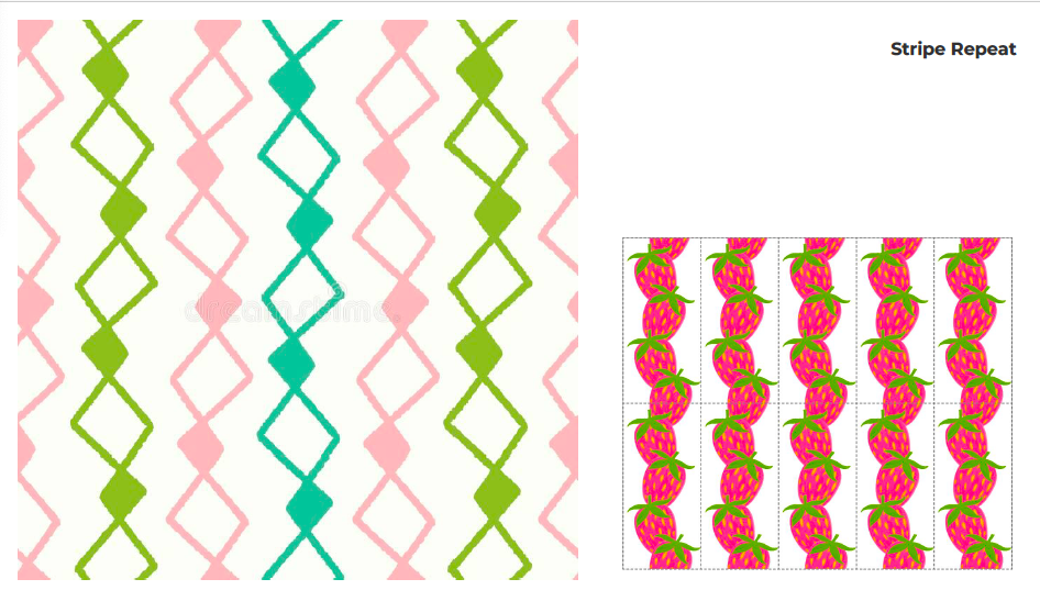
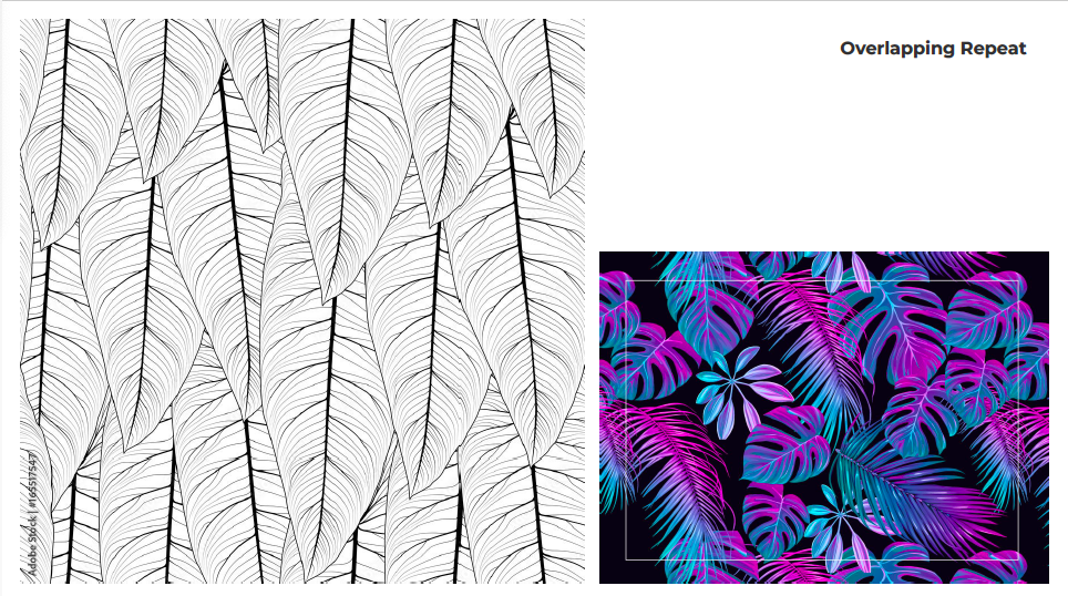
PATTERNS STRUCTURES

RESOURCES:
- Color Theory for Designers: Smashing Magazine: https://www.smashingmagazine.com/2010/02/color-theory-for-designer-part-3-creating-your-own-color-palettes/
- ADOBE Color: https://color.adobe.com/create/color-wheel/
- How to Blend Colored Pencils: https://www.youtube.com/watch?v=bKdPgdcWmfY
- Color Theory Basics: https://www.youtube.com/watch?v=YeI6Wqn4I78
- Controversial Color Theory: RYB vs CMYK Color Wheel: https://www.youtube.com/watch?v=yRQmV4XYmqI&list=RDCMUCibTRXCGW9o16HjUODtvTVQ&index=2
- What is the Difference Between Additive and Subtractive Color Mixing?
https://www.color-meanings.com/additive-subtractive-color-mixing/ - Animated Science: Light Mixing Colors: https://www.youtube.com/watch?v=UWmS7eCYaM4
- Explore Primary Colors of Light:
https://lsintspl3.wgbh.org/en-us/lesson/buac20-int-primarycolors/1