
ASSIGNMENT 4: WORD + IMAGE (20 pts)
Jump to Assignment Description
INTRODUCTION - LECTURE
Typography incorporates all the visual components of the written word. It is the art (and also technique) of arranging type to make written language legible and readable, with the goal of (typically) making it appealing.
Arranging type involves selecting typefaces, point size, line length, line-spacing (leading), letter-spacing (tracking), and adjusting the space between specific pairs of characters (kerning). Typography is the study of type and how to use it to aid in the communication of specific messages.
Designers use type to organize content, lead the eye around a page, command attention, and even move the reader through a document. It can be used to make artful design out of letters and words to emphasize the meaning of a design. Type also makes the content (text) easy for the reader to read and comprehend.
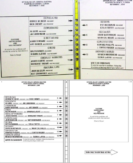
Poor use of type can cause comprehension problems and lead to real issues as seen in the 2000 presidential ballot debacle in Florida (see image below). Poor design, including the use of type, can have far reaching effects. For this reason, it's important for young designers to understand typography and the communicatory ability that is affords.
Typography surrounds us everywhere we go, but many people have never thought about it, or don't even notice it. Where do you notice type and fonts? Clothing or energy drink brands? Video games? Can you describe the feeling the type you see everyday is meant to convey? Look in your textbooks and notice how the information is displayed in terms of headlines, subheads, sidebars, and quotes. Comparing typography in textbooks raises awareness of why the text is presented as it is. Typography is an art form.
The History of Typography - an Animated Short
Typeface Anatomy: Download PDF
Understanding the anatomy of a typeface can help you conduct more productive critique and discussion about type. There are many intricate details when one looks closer at a type character itself (see the Typeface Anatomy pdf).
Looking at the handout, when comparing serif typefaces to sans serif typefaces, it's evident that serif typefaces in general have smaller x-heights and longer ascenders and descenders. The cap height is generally shorter than the length of the ascender. In addition, the letter "o" dips below the baseline just ever so slightly.
Knowledge of the anatomy of typography helps to look at a typeface more critically and make better informed decisions when selecting a typeface for a project. It will also helps when explaining why you chose a particular typeface to express a certain feeling or personality.
PAIRING FONTS
Font pairing takes a lot of practice and patience. Comparing or using different typefaces together and deciding if they communicate the desired message is as much an art as a learned skill. There is a craft to it, with no two designers pairing fonts in exactly the same way. The beauty lies in the infinite ways type can be combined to enhance communication. Keep in mind, there are typefaces that just don't work together stylistically and/or would send the wrong message.
Some general guidelines when pairing type are:
- All caps with a script
- Skinny & chunky
- Fancy & simple
- Pair the lower case with the capitals of the same font
- Different but similar styles
- Wide & narrow
- Tall & short
Typographyic Doubletakes: https://www.typography.com/blog/typographic-doubletakes
Type Designers:
- Wolfgang Weingart: https://www.typographicposters.com/wolfgang-weingart
- Neville Brody: https://brody-associates.com/
- 10 brilliant Female Creatives Creating Letters today: https://www.printmag.com/featured/10-wildly-talented-female-type-designers/
More:
- Warren Lehrer: spreads from book "French Fries"
- April Grieman: Made in Space
Artists that work with Type:
- Barbara Kruger: https://www.moma.org/artists/3266
- Jenny Holzer: https://projects.jennyholzer.com/
- Carrie Mae Weems & Social Studies 101, Operation: Activate, 2011: https://carriemaeweems.net/galleries/operation-activate.html
HIERARCHY
Hierarchy is the organization of elements on the page to draw the reader's eye to the first, second, third, etc. most important messages to be communicated.
What graphic designers do is organize information so it can be easily understood and easily followed. The focal point grabs the eye first, then another contrasting element takes the reader's eye from the focal point to the second most important point. Follow that up with yet another element that perhaps gives even more detail than the first and second layers did. This is the beginning of a typographic design.
All of the principles of design can be used to create hierarchy. For example, by pairing serif and sans serif typefaces together, the text can better illustrate and reinforce the intended message. Size is also a factor. The largest typographic element on the page doesn't particularly have to be the focal point. There are ample additional ways to create emphasis, such as with the use of color and space.
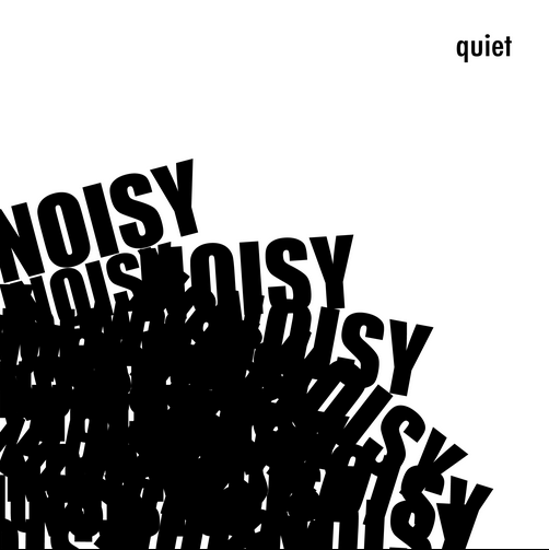
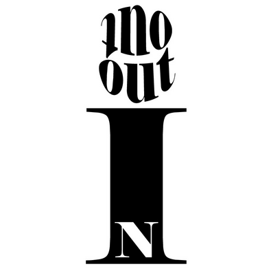
TYPE as IMAGE
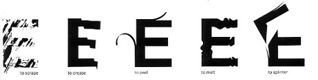
ACTIONS
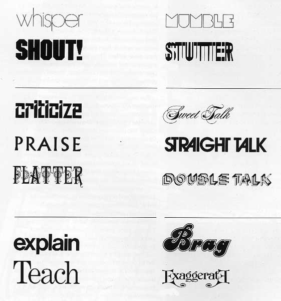
TYPEFACES as MODES of EXPRESSION
TYPE + MEANING
DESCRIPTION:
This final assignment of the semester has several components:
- type/word as image,
- sound as image,
- gestalt/user exprience
- and user interface.
The final output is of this assignment are animations with sound working with Adobe After Effects. The maincharacters of the animation are TYPE and SOUND. TYPE/ a VERB is presented to communicate its meaning, juxtaposing the this visual with SOUNDS that extend the meaning and viewers experience. Additionally, you will develop 3 navigation icons for moving in and around the animations suggesting a prototype for an interactive presentation.
WHAT TO DO:
IN CLASS THURSDAY APRIL 4
INTRODUCTION to ASSIGNMENT 4
PT1
READ the material above related to this assignment.
READ the following in your textbook, Graphic Design The New Basicsby Ellen Lupton and Jennifer Cole Phillips, © 2015
- pp 61-67, Scale
- pp 129 - 139, Hierarchy
PT2
CONCEPT - COMPOSITION - PRINT + SOUND
- CHOOSE a RANDOM VERB.
- TRY these random verb generators.
- Random Lists: https://www.randomlists.com/random-verbs
- Random Verb Generator: https://randomwordgenerator.com/verb.php
- TRY these random verb generators.
- ON SKETCHBOOK PAPER draw 5 interpretations of the verb your selected in such a way as to define its most common and literal meaning.
DUE TUESDAY April 9. PT1 + PT2; CRITIQUE
IN CLASS TUESDAY April 9
- CRITIQUE SKETCHES and respond to quiz/exercises based on readings
- Participate in DEMOS on working with TYPE
- filling a shape
- placing along a path
- breaking apart
- cutting away
- placing letters on layers
- Based on feedback from the CRITIQUE, DRAW selected Verb interation
- OPEN ILLUSTRATOR
- Set up a new file with the following criteria
- 300 ppi/dpi resolution
- CMYK color
- Set the four values for Bleed to 0.125 in (1/8th of an inch).
- 3 artboards 12 inches square
- On a base layer draw a RECTANGLE on each artboard; this will function as a border for your typographic composition.
- NO FIll
- STROKE, Black, Solid, .5 width
- SAVE this .ai file in your assign4 folder.
- Set up a new file with the following criteria
- OPEN ILLUSTRATOR
- This typographic composition will be interactive; develop 3 icons to be a integrated into the composition AND prompt the viewer to touch.
- Feel free to explore online resources.
- The Noun Project is is a repository of copyright free icons.
- you will need to set up a free account to download
- download .eps files only; they can be opened in Illustrator
- The Noun Project is is a repository of copyright free icons.
- Feel free to explore online resources.
- EXPLORE SOUNDS that relate your concept. Sounds must be copyright free; no speaking or voice recordings.
- FreeSound Project has lots of options: https://freesound.org/
HOMEWORK - continue this work in class on Thursday April 11
- DEVELOP 3 DIFFERENT CONCEPTS for representing the meaning of the verb your selected typographically
- DEVELOP 3 ICONS, using illustrator, that can be integrated into the compositions AND prompt the viewer to touch.
- CONSIDER where you will place the icons within the typographic verb composition
- Bring headphones to class
DUE THURSDAY April 11.
IN CLASS THURSDAY April 11
- DEVELOP 3 DIFFERENT CONCEPTS for representing the meaning of the verb your selected typographically
- DEVELOP 3 ICONS, using illustrator, that can be integrated into the compositions AND prompt the viewer to touch.
- CONSIDER where you will place the icons within the typographic verb composition
- CHOOSE 9 SOUNDS that expand the narrative/the viewer's experience
- will only use 3 sounds in the final work
HOMEWORK
- COMPLETE the 3 iterations of the verb typograpically using Illustrator
- PRESENT your 3 concepts for the interactive icons developed using Illustrator; situate them within the type compositions
- place the icons on a separate layer in your .ai file
- SAVE the .ai file
- SAVE AS an Adobe PDE file
- PRINT the 3 Illustrator/PDF files on 11" by 17" paper
- DOWNLOAD 9 SOUND files
DUE TUESDAY April 16. CRITIQUE. Present 9 sounds files, 3 typeographic iterations of the verb selected with the icons developed
PT3
INTRODUCTION TO AFTER EFFECTS
IN CLASS TUESDAY April 16
- CRITIQUE - prints and sound files.
- Make last minute revisions to Illustrator iteration of selected verb and interactive icons and sound files .
- IMPORTANT: SAVE ALL FILES RELATED TO THIS ASSIGNMENT IN ASSIGNMENT 4 FOLDER
- DEMOS on working with After Effects:
- composition settings
- 16:9 aspect ration for HD
- 1:1 aspect ration for Mobile/Social Media
- composition settings
- color - RGB
- SAVE your .aep file
- importing audio files
- Importing Illustrator files
- navigating the interface
- making compositions
- setting up keyframes and animating using the TRANSFORM options in the timeline layer panel
- scale
- position
- opacity
- rotation
- setting the anchor points using the Pan Behind Tool
- controlling sound
- PLAN how you want the graphic elements to move in reltion to the sound.
IN CLASS THURSDAY April 18
- Work in Class making your animations:
- Make a new composition inside your .aep file for each of the 3 versions of your TYPE/VERB, their corresponding sound and icon.
- Develop the navigtion icons and insert them into your animation; be sure to make a version of the icon to indicate that a user selected it/clicked it.
- Be sure to add visual (and sound) feedbackfor the navigation icon to communicate it was selected and clicked.
HOMEWORK
- Continue working on your animation.
IN CLASS TUESDAY April 23 + THURSDAY April 25
- Continue working on your animation.
- Instructor will meet with you individually to provide feedback on work in progress and provide After Effects technical assistance specific for your animation.
HOMEWORK
- Work on your animation
- Review of Animations during next class
- Completed animations DUE THURSDAY MAY 2.
IN CLASS TUESDAY April 30
- Review Animations in Progress
- Make final revisions to Animations
- Demo on how to present final portfolios
HOMEWORK
- Complete all work for this assignment.
- Prepare FINAL PORTFOLIO
- CRITIQUE ASSIGNMENT 4
DUE THURSDAY May 2.
IN CLASS THURSDAY May 2
FINAL REVIEW of Assignment 4 animation + Final Portfolio Presentation!!!
Enjoy your summer!
VOCABULARY
Alphabet: a set of letters or symbols in a fixed order, used to represent the basic sounds of a language; in particular, the set of letters from A to Z.
Character (of type): a printed or written letter or symbol.
Hand lettering: is the art of drawing letters by hand, typically crafted for a single use (READ Smashing Magazine's article Understanding The Difference Between Type and Lettering—https://www.smashingmagazine.com/2013/01/understanding-difference-between-type-and-lettering/.)
Hieroglyphics: a formal writing system used by the ancient Egyptians that combined logogram and alphabetic elements.
Ideograph: a written character symbolizing the idea of a thing without indicating the sounds used to say it.
Kerning: to adjust the spacing between two characters in a piece of text to be printed.
Leading: the amount of blank space between lines of print. Pictograph: a written symbol that depicts an object.
Pictograph: a written symbol that depicts an object.
Texture: surface quality that can be seen and felt.
Tracking: the uniform increase or decrease in the spacing between a range of characters.
Type: printed characters or letters.
Typeface: a particular design of type.
Typography: the style and appearance of printed matter; the art or procedure of arranging type or processing data and printing from it.
Symbol: a thing that represents or stands for something else, especially a material object representing something abstract.
.............
Serif typefaces have small projecting features at the end of strokes, added as an embellishment to the basic form of the character. Serifs were needed when type was chiseled into stone, before paper was invented. In practice, serif typefaces feel timeless, elegant, trustworthy and retro. Most newspaper and magazine text is set using serif typefaces because they are easier to read, especially when there is a lot of text set at small sizes.
Sans serif typefaces lack serifs, and therefore feel cleaner, simpler and more modern on the page. Sans serif fonts are easier to read on a computer, because the square nature of the pixel makes the subtle curves on serif type hard to render.
The combination of serif and sans serif typefaces can be used in headlines, subheads, and lists. They complement each other and can help organize information in a way to make it more understandable for the reader.
Script typefaces are reminiscent of hand writing and lettering. They try to bring the same authenticity that hand writing creates. They are often used sparingly in combination with other typefaces.
RESOURCES
Illustrator Tutorials
- How to use Illustrator’s clipping mask and compound path tools
- Combine Shapes in Different Ways
- Use Masks to Crop Content
- MORE Illustrator Tutorials
- How to Cut Pieces out of Shapes in Adobe Illustrator: YouTube - Illustrator Quick Tips
- What are Compound Paths in Illustrator: You Tube - Illustrator Quick Tips
- Type on a Path in Illustrator: You Tube - Dansky
- Flip Text Using Type on a Path Tool on a Circle in Illustrator: You Tube - Designalogic
- 3D Gritty Shadow Text Effect: Nobu Design
- How to Create a 3D Shadow with the BLend Tool in Illustrator: Graphics Grrrl
TYPE
- Typography: The Anatomy of a Letter: envatoTUTS
- Understanding the Nuances of Typeface Classification: UI Design
- Typographyic Doubletakes: https://www.typography.com/blog/typographic-doubletakes
- Canva's Ultimate Guide to Font Combinations: https://www.canva.com/learn/the-ultimate-guide-to-font-pairing/